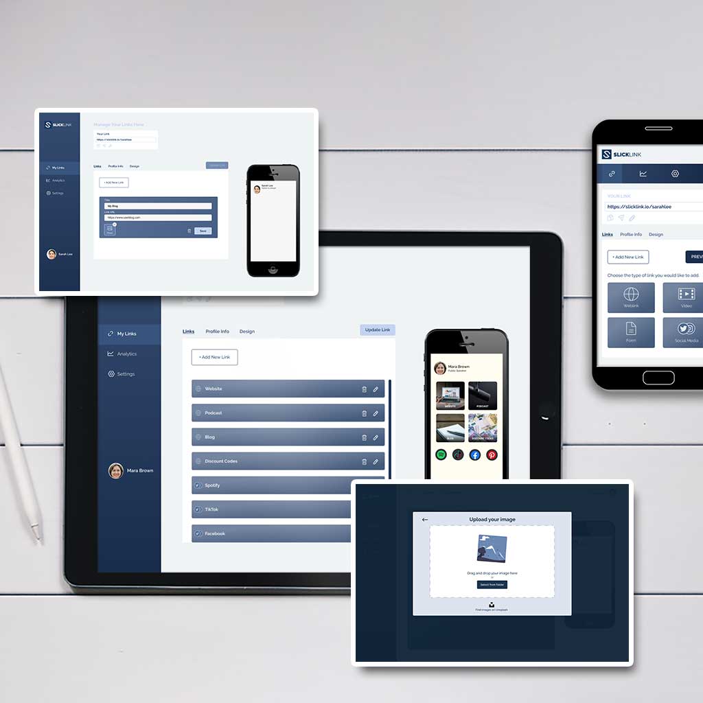
Project: Link Sharing Platform
Topic: Design process for building a product
Introduction
The company offers a platform for users to create a landing page on which to share web links and products in one overview.
Many people who work online with an audience need a place to share social and business links, so as to guide and redirect their customers.
Such links may include: Website, Affiliate Links, Social Media, Own Products, Contact
Problem - Comparable existing platforms have visual limitations to present links. The link profile oftentimes gives a very basic overview of the links a user tries to share and can’t be altered much further than in colour.
Solution - Since a lot of users share their link profile on Social Media platforms like Instagram or TikTok it seems logical to stick to similar visual designs. This could for example mean offering a better use of imagery to highlight shared links. In addition to that, the client would like to include more features, such as video embedding and contact forms.
1 - Market Analysis
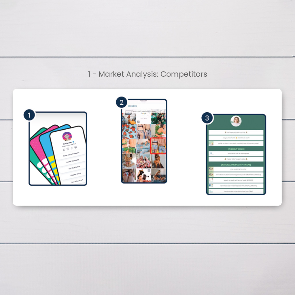
The designs of competitors have the following issues:
1) Design options that lack visual creativity
2) An abundance of imagery without explanations/titles
3) Combination of titles and images, but unorganised overview
Research conclusion: The goal of this project is to make it possible for clients to create a visually appealing link page that instantly explains where the link will lead an end user. The client can use imagery to make clicking on a link more appealing and can also match it visually with their existing brand design.
2 - User
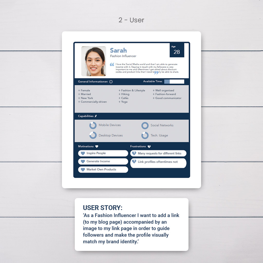
Moving forward the chosen persona (see images) and the user story will help determine technical criteria and necessities such as:
User Backend (where link page is created): Easy and fast to use; organised; self-explanatory, options
User Frontend (the result followers see): Individual brand design; good overview; helpful visuals
3 - User Flow
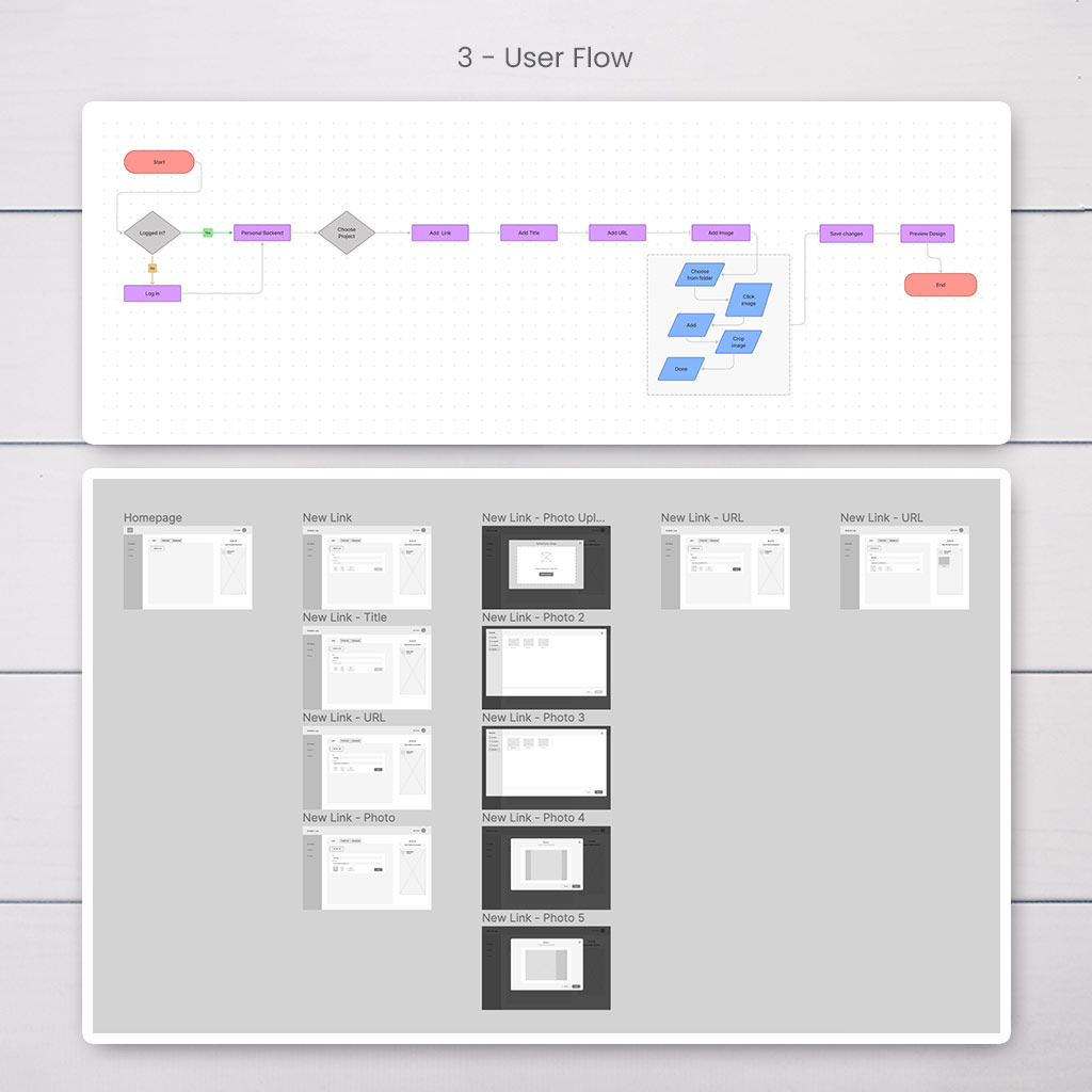
Site Planning: The idea for this project is to create the design and its functionalities for only one page, the Dashboard/User Backend, since the homepage already exists and is not part of this project for now.
Together with the User Flow and a Click Dummy the Wireframe can now be used to validate ideas via user tests. It is important to let a pair of fresh eyes have a look at the concept and try to fulfil a task. This can save a lot of time in the final design processes.
4 - Visual Concept
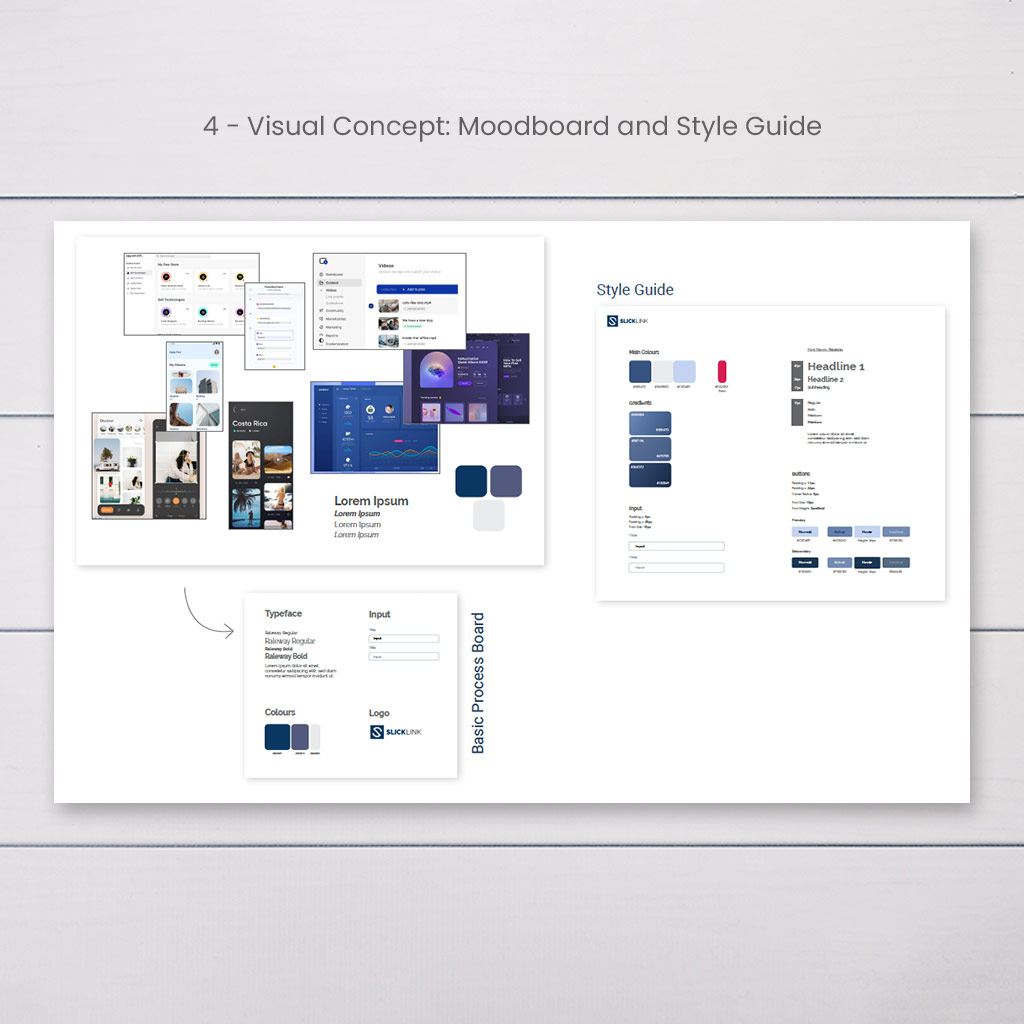
The next step is to integrate colours and style systems into the design. The first task is to find inspiration online and gather various looks on a moodboard. This is a great foundation to building a process board and finally a style guide, which is an important asset for designers as well as developers to help keep a consistent design.
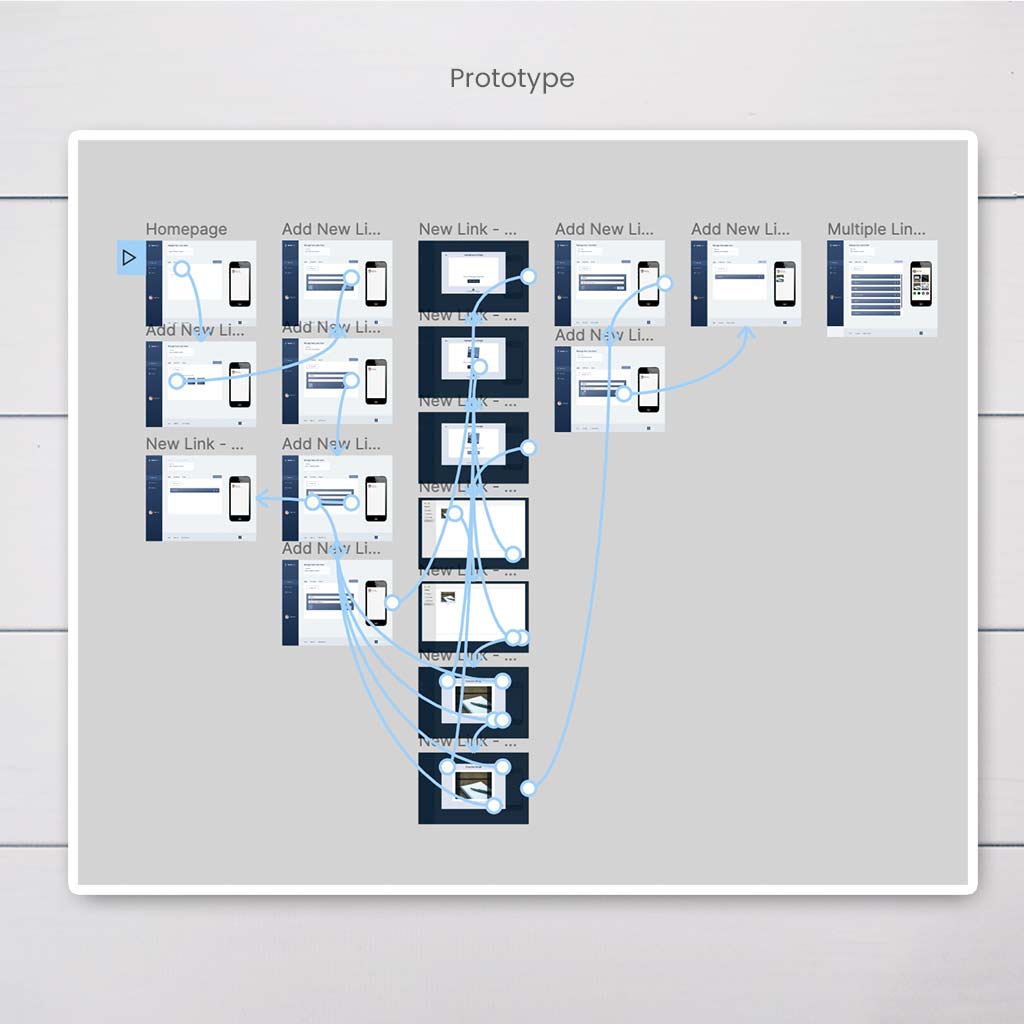
After the creation of these visual aids, it is time to work on the prototype in order to present a more realistic looking product. As soon as the prototype is ready more user test can be conducted to evaluate the concept and work on any necessary fixes.
Final Thoughts
The project had a short timeframe to be finished within, which initially made the task seem almost unattainable. However, due to the client’s previous research and clear ides a lot of time could be saved.
Certain features had to be included in the final design. Therefore it was quite challenging to integrate all of them logically and at the same time keep the design minimal and easy to understand.
There also was a good flow of communication with the developer assigned to this project, which helped with technical questions and is something to continue to strive for in future projects.
